Tuesday, February 28, 2017

Selective Focus

This is a picture from the movie Wait Until Dark starring Audrey Hepburn. It's about a murderer invading a blind woman's house, but the woman takes out all of the lights so there are very few light sources. I think the light from the fridge counts as an example of selective focus because it's the first thing that someone would look at in this photo. Once you look at the fridge, you immediately notice the killer on the right, then Hepburn on the far left. I like how this scene uses a light that fits into the scene rather than a spotlight because it's sensible and adds to the suspense.

The photo was taken by Marija Majerle. With the majority of the background being dark, the sunlight is the first spot a person's eyes would look towards. In addition to that, I like the early morning mood that comes from the light-dark contrast in this photo as well as the silhouette in front of the sunlight.

I think this picture is interesting because the sunlight's rays are shined directly at the blocks of wood, which is the focus point of the picture, yet the light still grazes over and slightly accents the man's face. 

I like this picture because the focus point of light comes from the Sun, yet it is shown through the pompous grass. I think it's intriguing how this natural lighting creates a contrast of shadows and illuminated pompous grass blooms between those that are angled to be in front of the sun versus those that are off to the side. 

Monday, February 27, 2017

Lighting and Movement

Firstly, I feel as if this video is a good example of lighting with movement. The choreography may not be the best, but the way that the lighting changes from person to person really intensifies everything that happens. What is especially cool about this video is the moments where there are people that's lights are blacked out are carrying other people and it makes it appear as if they were floating in mid-air. Of course, there is more to lighting than just having the outline of a person show up, and I feel as though that is where my next video is able to really shine.


This video is from one of the 2007 Alive tour from Daft Punk. I feel like this show is the epitome of stage lighting. Somehow the lighting is able to be capable of displaying great movement, despite being largely directed from the central location of the pyramid. This, coupled with the screens being able to display great amounts of different visuals, add to create a great cohesive masterful lighting show. I feel like despite the fact that everything in this show is primarily stationary, the lighting is able to make the viewer feel a great sense of movement overall. It also doesn't hurt that there is a nice soundtrack to listen to while viewing the lights either.

Thursday, February 23, 2017

(QUICK NOTE: I thought I hit publish but turns out I hit preview without saving and it deleted everything and I just now noticed?? Sorry!!)


This video features a guy wearing some really cool LED gloves. There appear to be colored LED lights in the fingertips of the gloves, and they appear to be quite bright. The man wearing the gloves also seems to have incredibly nimble fingers, as they move with such a fluid and mystical manner. The light from the gloves seems to move and create shapes with how fast the movements of the man's fingers. The streaks and fuzziness of the light highlight the movements perfectly.


In this video, video projection is used to accentuate the movements of the dancers. Swirls, shapes, waves, twinkles, and more are projected behind the two on stage, and are the only thing breaking up the monotony of the blue wash on stage. It looks like the dancers themselves are drawing and creating the shapes around them, and it shows just how fluidly they move.

SydneyQ2M2

SarahQ2M2

MalikQ2M2

DanielQ2M2

CelesteQ2M2

CaseyQ2M2

BriahnQ2M2

BrentQ2M2

AlexQ2M2

IvanQ2M2

ElizibethQ2M2

AlexisQ2M2

KodyQ2M2

Movement and Lighting


How You Get The Girl - Taylor Swift (The 1989 World Tour) from Asher Levine on Vimeo.

This is from Taylor Swift's 1989 concert, don't turn the sound on cause this recording is terrible quality. She is lit mostly by the lights on her dress, the lights in the umbrella's the dancers are holding and the lights in the dancers suits. You can also see towards the end of the video that the crowd all has light up wrist bands similar to the lights we saw at the half time show from the superbowl because at the end of the song all the lights change to blue and then fade out. Also after the song ends her dress changes colors because the lights inside of it, I assume the square pack on her back may be the power source for the lights or the box that controls the lights from a computer (or both) I don't really know how they did it but I think its really cool and I want a dress like that.


This video has a neat effect of the light going from really blueish white to a softer yellow. The change in light is because of the change in setting and the change in light source. I think the light also signifies that its kind of all in her imagination.

Movement in light

I thought this fit nicely with the idea of moving lights. It relates to Lady Gaga's Superbowl halftime show we watched in class. It's Disney and Intel's Drone Christmas show, and the lights are definitely used to create an illusion. I think its really amazing that they are able to have that many lights working together so seamlessly.
This is really spectacular. The lights are moved by the people in the "forest". It gives the illusion of a forest by the set up of the light, but the people are a very important part of the work. Without the interaction it would just be a bunch of green light fixtures standing still across the space; having the lights be stagnant obviously takes away from the idea of a forest.


(Start at 1:44) This performance is interesting because the lighting isn't used as a background to highlight the person, rather, the person is covered head to toe in the light source. I think the contrast between the red and blue help the audience to distinguish some of the movements of the two individual dancers and their meanings.


I think these performances are different from the first one because a lot of these do not highlight the entire body, but will highlight the main focus and movement of what the performers want the audience to see. At times, the illuminated parts of them do not even look like people, however, almost all of these performances are put on by illuminating parts of the people in the video.

Wednesday, February 22, 2017

Dancing with Moving lights

This first one is one of the segments from Britain's Got Talent. They reminded me of the handheld lights in Lady Gaga's Halftime Show. These actually appear controlled by pre-programmed lighting in the suits rather than by location tracking. The fact that they turn off and on in strategic ways make it look like there are only three characters at a time that move in unreal ways and "teleport" when lights turn on and off, creating really impressive and unique effects.

The interesting lighting and moving fixtures of this dance begins at 2:40 of the video, but the point where I noticed moving lights really being intentionally utilized is after 3:25 where the lights follow the moving circle, enhancing the feeling that the group is surrounding and essentially crowding the individual in the middle. This idea is that the lights move around to create chaos and confusion for the dancer in white, but then focus in the center to create the feeling of suppression. After a while, there is a contrast with spotlights following a single dancer, making that individual seem as if they are alone and have freedom to do as they will.

Creating Movement with Lighting


In this video, the designer uses both projections and front lighting to create the illusion of movement. One of the scenes is of a rising sun, using projections to begin the image down left, before showing it rise to the sky. Orange light was then cast on the top of the structure to complete the entire image, which soon morphed in to a flag. The layering of the two gave depth to the design, making the images appear more realistic. I really liked the way that the designer used pools of darkness throughout parts of the piece, it drew  my eye in closer and helped me know where to focus my attention during the show.

In this Taiwanese dance club, the ceiling features hanging strands of lights which work in sync to create the pulsing images seen above. Individual bulbs of light run up and down each strand, but the images appear to ripple across the entire ceiling. It's flawlessly timed to the music, which I think amplifies the illusion of movement.

Movement in Lighting


This video shows the actor "controlling" the light, and both stopping it and spinning it around. It's interesting seeing how in sync the actor is with the lights; that means that there had to be lots of choreography and practice done in order to match up the actor's movements and light movements. It helps make the actor seem more powerful as well.


In this video, the dancers use light on their gloves to enhance their dance movements. It appears that the dancers are being lit mostly (or almost entirely) by the light gloves, so it really makes you focus on how they are moving. I also really like how they change the colors they are using to match the music and change the mood.

Movement in/with Lighting

I always enjoying seeing two forms of art come together, so I was really excited to see how dancing and lighting would work together. The lighting effects are so in sync with the dancers, it's almost as if the dancers are the ones controlling them. And the colors creatic a sort of mythical/angelic scenery

In this video, the lights move based on a person's movement. While watching it, I looked at how quickly the bulbs would change color and direction as soon as a person moved. They created a new scenery in the blink of an eye!

Movement in Lighting


In this video, I think the lighting and effects certainly make the movements more enhanced and more stylish. I think the effects and lighting also help make the dancers look more eloquent and smooth. The blue and white give a spiritual feeling to the piece.

In this video, there were shadows that looked like they were moving because of the changes in lighting and where the lights were directed. There was also the use of covering the lights to have the light shine at different angles. I think this is really cool how lights can change the way the audience views objects.

Monday, February 20, 2017

Bad Theatre Lighting

This first photo has too much dark colored fabrics in contrast with the bright white light. It is not warm or pleasant but instead harsh and white and makes the face of the actor diminished and her skin almost fluorescent. 

This photo has the light focused on the one girl in the middle rather than the woman at the edge of the stage who appears to be talking. The light cuts off the woman's faces and makes it so you cannot see all of them. 

Saturday, February 18, 2017

Interesting Theatre Lighting


This lighting design is most interesting to me because despite it's appropriate color choices, I can't say where the focal point of the scene is. The use of red clearly captures the essence of passion and blood, supported by the actors on the ground, but I think it may have been more effective if it was used as a front light rather than back light. I'm most drawn to the red rectangles in the background, with my attention turning to the action second. The contrasting blue light helps to round out the dramatic tone of the scene, yet it's brightness is so low that the actors are mostly in shadow.


I much prefer this design to the first, and think the color choices are tasteful and poignant. This example of red back light creates a feeling of love, which fits the three couples pictured downstage, highlighted by the yellow down light. These isolated pools of yellow have a gold quality to them,  suggesting that the subjects within them are somewhat of a treasure. The band in the back is still adequately lit yet not distracting, and the whole stage has a very cohesive look. 

Thursday, February 16, 2017

Satisfactory & Unsatisfactory Lighting

A photo from a production of Shakespeare's MacBeth
I think this lighting design looks incredibly gaudy, and I am not a fan. I appreciate big choices, but this one feels way too in my face. Granted, I have very little context for this show and the other artistic choices throughout. I do know, however, that this is from a production of Macbeth. I don't want to knock the designer's choices without seeing the entire show because this setup could be extremely effective within the setting of an entire show. But my gut reaction when I came across this photo was negative - I actually flinched.

A photo from a production of Sally Nemeth's Holy Days
This lighting design, however, is extremely appealing to me. The show is about two couples during the Dust Bowl and the Great Depression. While I don't know the play's plot, I feel like this design conveys everything it needs to in a much more subtle manner. The lighting is fairly stark other than washing the stage a golden yellow to convey dust and sand. I can feel the sun pounding down on the characters' backs and the desert heat rising up from the floor. 
Interesting/Bad Lighting in theater scenario

This lighting is interesting because even though it doesn't illuminate the main character it creates a really cool effect of ominous.

This lighting is really cool because it seems to exchange the option of lighting everybody for creating a feeling of almost desolation and emptiness. Good trade off.
This lighting set up basically has every color of the rainbow. I think this lighting could be a good set up for a small number of types of scenes, however, this does not seem ideal for lighting characters on a stage. 

This lighting is obviously mainly red and gives off a vibe of anger or love. I think this might be an okay lighting design for one scene, however, I think for one to use it throughout a production would be slight overkill unless there are special circumstances of the production which call for this type of red-colored lighting.

Interesting and Bad Color


I feel like the lighting in this photo definitely exhibits the characteristics of having some bad color choices. For one, I have no clue what is going on in this scene, partially due to the very little that action that is occurring, and partially due to the color choices. The entire room is lit blue except for the central focus, which is seemingly lit as some pinkish color; the blue is causing me to feel a nighttime / somber feeling, but then the sudden shift to the pink breaks that and creates a bit of disorientation really. Perhaps though this is exactly what they were going for?


This photo mainly uses blue light, with some added bits of intense and focused white(r) light. The interesting thing about this one is how they focused the lighting directly onto the hands of the performers. This is done because this performance was done by the Deaf West Theatre. All of the performers perform via ASL and the lighting has to be focused onto the hands so that the audience can follow along. Overall I think the most interesting thing about this lighting and the color choice is that the focused light creates such a cool effect with the haloing around the performer's hands.

Wednesday, February 15, 2017

Interesting lighting in Theater


It is difficult to determine "bad" color when I don't know what the intention of the piece is. However, I don't think it was the intention to have the light sources visible as well as the light trail. If it was, I would consider that an interesting choice. This is from the set to Beauty and the Beast. The blue colors give the appearance of moonlight coming from different places into different windows, which is not a good choice in my opinion since moonlight should only come from one place.

Image result for theater lighting
This is another interesting photo of lighting having a more significant effect on what is going on in the play. Here there is a character that is backlit with a spotlight while another one is lit by a pool of light with a design, like a gobo. It was an interesting choice to make the color for each character's light so different in temperature. The spotlight is much brighter and warmer than the other light, but I wouldn't judge on whether or not it was a bad choice on the designer's part.

Interesting/Bad Color


I think is interesting because of the small lights around the characters in the circle. I also think it is interesting how the person on the right seems to have more light on her than the others. This could be due to the costumes and makeup. I also like how I cannot tell whether there are gobos on some of the lights or they are just shadows that give the designs on the stage.


In this second picture, I think the lighting is interesting because there is the moon in the background which should be the light source, yet the light does not come from that direction. The light appears to be coming from stage left as there are shadows going stage right.

The first picture reminded me of the lighting Tim showed us in the auditorium. The stage looks like a forest at night. The most interesting part was how the light is brightest over the actors in a circle. It looks like a full moon is shining directly on them, like a spotlight.

The balloons in this picture look like they are almost moving up the side of the house prop. The curved side of the building. The blue background is done well, it makes the background look painted since it does not interfere with the balloons, window, and actors.

Interesting/Bad Coloring

This is a picture from the Broadway production of the Lion King. I really like the the the theater uses warm orange and red colors to capture the natural colors of a savannah sunset. The lighting is also used only in the background so that only the silhouettes of the characters in the foreground are seen, giving the illusion of real animals. 
I am not sure what production this pictures is from, but I enjoy the use of the hanging light bulbs in the background emulating stars. From what I can tell, this pictures is depicting a flood or similar natural disaster. The use of a reflective ground makes the set look like water.


This still, from The Poor of New York, is not great lighting, in my opinion. The entire stage is just so strangely lit, with strange white light and the central chandelier, that the eye isn't sure where to look. It is entirely too busy, and overall, just not pleasing to the eye. If this was the intended effect, then by all means, it's wonderfully lit! But otherwise, I've definitely seen much better styling.


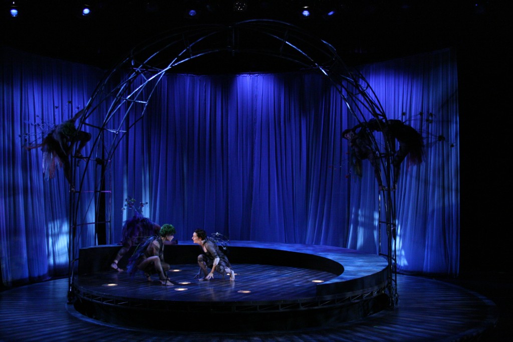
This still, from a performance of The Crucible done by Henderson State University, is very interesting. The light blue wash is eerie and otherworldly in itself, but the true masterpiece is the textured gobo they decided to use. The patterns, of crooked trees and branches, are grim and unsettling, matching the tone of the play about supposed witchcraft and the looming threat of death well.
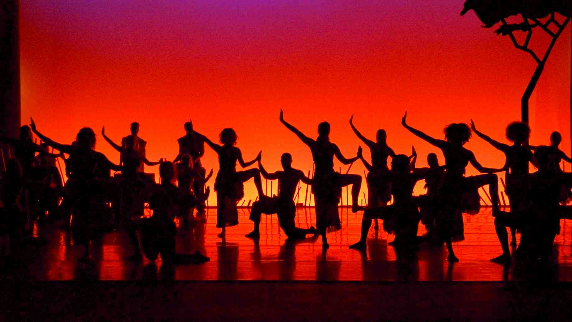
Just Interesting Color Use


This photo comes from Pinterest. What interested me was the different color spotlights shone on the groups of nuns. It makes me think that there are two different sub-stories happening at the same time.  Judging by the blue wash of a spotlight, I believe that the group on the right side has a more emotional story compared to the one on the left.

I found this photo featured on thelightingconnection.com. I'm confused by how the lighting director was able to make a yellow wash for the group circled around the two people in the center. However, I like how the white light makes them the more important subject of that scene while the group blends into the stage, making them more of a background rather than lead actors.

Interesting/Bad Color

This photo shows the use of interesting color in this setting. You can see the spotlight is making the audience focus on the two characters in the front, but there's another light behind the white curtain in the back showing you the silhouettes of the other actors. The purple lighting also almost disguises the character who is in front of the curtain. The lighting is interesting because it helps you focus on one part, but it distracts you as well.

I think this could be considered bad lighting. While I can assume that there is "moonlight" lighting the characters, the light is coming from up front. I consider it bad because the moon is seen behind them, so the lights are cheating a little bit. Maybe if the characters were more backlit, then I think it would make the lights a little better.

Monday, February 13, 2017

Interesting & Bad Uses of Color


This photo is from a production at the University of Florida, however, the play or performance the picture was taken from is not specified on the website. I thought this was a very interesting use of color. It is very clear that it is meant to imitate a sunset, the colors also make the performers stand out in the environment being represented. I was also drawn in by the colored light coming from behind them.


This image is not an effective use of color, in my opinion. The intensity of the light washes out the actress that is meant to be the focus. The colors on the boat in the background also fail to set a mood, but rather just seem to be used to make it less distracting. It may be an attempt at a dawn or dusk but this is not clear with the red/purple color used.

Thursday, February 9, 2017

My Photos


I took this photo while walking around my neighborhood back home in Houston.
Even though this photo is taken under the shades of many trees, there is still a lot of natural light. My favorite part of the whole photo is the dappling pattern made of the ground by the sun filtering through the branches and leaves. I like how the background of the photo looks overexposed; it makes me feel like the distance between me and the stop sign is even greater.


I took this photo while walking around my neighborhood here in San Antonio.
I like how the sunset in the sky backlights all the trees, so they look like paper silhouettes against a watercolor sky. However, there is still enough natural light to see some detail in the house along the bottom. The colors are more muted, though, because they are still somewhat in shadow. The clouds provide and interesting pattern scattered across the sky.

Personal Photos


I took this photo on a foggy night/morning a few weeks ago. I was honestly stunned when I walked out of the building and saw basically 4 sources of light just pointed directed at me. I didn't frame this photo as nicely as I could have, but I was also just using a phone camera, c'est la vie. I also just think that this one was more of an interesting thing to have seen in person than how it ended up turning out in photo.


I took this photo summer 2015 on the Staten Island ferry. The lighting isn't all to interesting in this photo. The most significant aspect of the lighting is that the entire sky is lit up quite brightly, despite the sun being nowhere in the photo. I think the varying shading between the sky, city, and the water give the photo s nice palette and really just gives off a beautiful shot. 
I also just really like this photo because there is a bit of a surreal look to it. The city doesn't look like it's as large as it should be. (Also there is a tiny Statue of Liberty in the mid left of the photo) 

Wednesday, February 8, 2017


This is a picture of my chihuahua looking out the window. The car shadow covers some of his head, making the face and ears the focus of the picture.


I took this picture during Christmas time in the Riverwalk. It is nighttime, so there's obviously no natural light,but the lights hanging from the trees make the space look very full and chaotic, while the candle lights on the floor by the river provide order to the space. My favorite part is the red lights reflecting the water increases the amount of light shining to me.

Personal Photos


This photo was taken along a local walking trail, near the Blue Star Arts Complex. The bright sky illuminates the entire scene, giving a glowing quality to the bright green plants. It back lights the bench, which is the focal of the photograph, giving it a strong silhouette.

I was lucky enough to capture this photo on a flight into Santa Fe, at sunset. I love how the light is limited to it's form in the middle, leaving large portions of the image in shadow. The colors are intensified and compliment the city lights below, giving a sense of movement to the picture.  

Personal Photos

I took this photo walking back to my dorm from the library. I like the way the lights in the trees and above the trees give the trees shadows. I think it the way the background is a brighter green makes the foreground and shadows look darker.


I like the shadows made by the lights in this image. They are really dark and the outlines can only be seen, but I think they add to the darkness of the night. I also like the light on the grass giving it a light green color. It looks like a path. I think the darkness of the trees, caused by the lighting, in the background makes them appear as if they continue into the sky. It is like a sandwich of darkness.


Personal Photos

This photo is on campus over by the pool. It must have been at noon or close to it because the sun was directly above the panels of the "roof" over this patch of cement. I really like this picture because of the lines made by the shadows and the contrast between the light on the cement with the dark lines above. 
This picture was taken down at the Pearl! I like it because of the light coming through the windows draws attention to them but the light under the door bleeds through that little crack which makes a cool effect on the ground as well. 

Personal Photos


I took this photo around Christmas time while driving around nearby neighborhoods looking at Christmas lights. I think my favorite thing about this picture is the spectrum of colors lights can produce.


I'm in this photo (pictured on the right), but I like this photo a lot because the lights closer to the camera look so different from the ones further away. Additionally, I like how the light surrounds my friend and I in this picture. These lights also made for super cute pictures at a rush event. 

Personal Photos


This photo I took at Mi Tierra in San Antonio. They had a bunch of lights and lamps hanging from the ceiling, so they stood out from the dimness of the restaurant. I like how the lights in the front are focused while the ones in the back are more blurry. It almost looks like a starry night.


I took this at the San Antonio Botanical Gardens. It was a really overcast day, but the sun was still really bright. I like how the light shines on the top of the statue's hand, and how the bottoms of the fingers are in the shade. I think it helps create more depth on the statue, and makes it stand out from the mostly lit background.

I took this picture in San Francisco, right outside Golden Gate Park. My friends and I went to a conference in SF but we were able to escape for a couple of days and explore the city. I really liked how the light highlighted certain facets of the building, and almost cutting it in half with the light.

This is a picture of the lab where I work. I took this picture over the summer to show my extended family right before I visited them in New Jersey. The shadows cast by the exterior of the building from the sun made a pattern on the different parts of the lab that I really liked. I also enjoyed the black chair and its shadow, making it look like a reflection of the chair on the ground.