Showing posts with label Interest/Bad Color. Show all posts

Monday, February 20, 2017

Bad Theatre Lighting

This first photo has too much dark colored fabrics in contrast with the bright white light. It is not warm or pleasant but instead harsh and white and makes the face of the actor diminished and her skin almost fluorescent. 

This photo has the light focused on the one girl in the middle rather than the woman at the edge of the stage who appears to be talking. The light cuts off the woman's faces and makes it so you cannot see all of them. 

Thursday, February 16, 2017

Satisfactory & Unsatisfactory Lighting

A photo from a production of Shakespeare's MacBeth
I think this lighting design looks incredibly gaudy, and I am not a fan. I appreciate big choices, but this one feels way too in my face. Granted, I have very little context for this show and the other artistic choices throughout. I do know, however, that this is from a production of Macbeth. I don't want to knock the designer's choices without seeing the entire show because this setup could be extremely effective within the setting of an entire show. But my gut reaction when I came across this photo was negative - I actually flinched.

A photo from a production of Sally Nemeth's Holy Days
This lighting design, however, is extremely appealing to me. The show is about two couples during the Dust Bowl and the Great Depression. While I don't know the play's plot, I feel like this design conveys everything it needs to in a much more subtle manner. The lighting is fairly stark other than washing the stage a golden yellow to convey dust and sand. I can feel the sun pounding down on the characters' backs and the desert heat rising up from the floor. 
This lighting set up basically has every color of the rainbow. I think this lighting could be a good set up for a small number of types of scenes, however, this does not seem ideal for lighting characters on a stage. 

This lighting is obviously mainly red and gives off a vibe of anger or love. I think this might be an okay lighting design for one scene, however, I think for one to use it throughout a production would be slight overkill unless there are special circumstances of the production which call for this type of red-colored lighting.

Interesting and Bad Color


I feel like the lighting in this photo definitely exhibits the characteristics of having some bad color choices. For one, I have no clue what is going on in this scene, partially due to the very little that action that is occurring, and partially due to the color choices. The entire room is lit blue except for the central focus, which is seemingly lit as some pinkish color; the blue is causing me to feel a nighttime / somber feeling, but then the sudden shift to the pink breaks that and creates a bit of disorientation really. Perhaps though this is exactly what they were going for?


This photo mainly uses blue light, with some added bits of intense and focused white(r) light. The interesting thing about this one is how they focused the lighting directly onto the hands of the performers. This is done because this performance was done by the Deaf West Theatre. All of the performers perform via ASL and the lighting has to be focused onto the hands so that the audience can follow along. Overall I think the most interesting thing about this lighting and the color choice is that the focused light creates such a cool effect with the haloing around the performer's hands.

Wednesday, February 15, 2017

Interesting lighting in Theater


It is difficult to determine "bad" color when I don't know what the intention of the piece is. However, I don't think it was the intention to have the light sources visible as well as the light trail. If it was, I would consider that an interesting choice. This is from the set to Beauty and the Beast. The blue colors give the appearance of moonlight coming from different places into different windows, which is not a good choice in my opinion since moonlight should only come from one place.

Image result for theater lighting
This is another interesting photo of lighting having a more significant effect on what is going on in the play. Here there is a character that is backlit with a spotlight while another one is lit by a pool of light with a design, like a gobo. It was an interesting choice to make the color for each character's light so different in temperature. The spotlight is much brighter and warmer than the other light, but I wouldn't judge on whether or not it was a bad choice on the designer's part.

The first picture reminded me of the lighting Tim showed us in the auditorium. The stage looks like a forest at night. The most interesting part was how the light is brightest over the actors in a circle. It looks like a full moon is shining directly on them, like a spotlight.

The balloons in this picture look like they are almost moving up the side of the house prop. The curved side of the building. The blue background is done well, it makes the background look painted since it does not interfere with the balloons, window, and actors.

This still, from The Poor of New York, is not great lighting, in my opinion. The entire stage is just so strangely lit, with strange white light and the central chandelier, that the eye isn't sure where to look. It is entirely too busy, and overall, just not pleasing to the eye. If this was the intended effect, then by all means, it's wonderfully lit! But otherwise, I've definitely seen much better styling.


This still, from a performance of The Crucible done by Henderson State University, is very interesting. The light blue wash is eerie and otherworldly in itself, but the true masterpiece is the textured gobo they decided to use. The patterns, of crooked trees and branches, are grim and unsettling, matching the tone of the play about supposed witchcraft and the looming threat of death well.

Just Interesting Color Use


This photo comes from Pinterest. What interested me was the different color spotlights shone on the groups of nuns. It makes me think that there are two different sub-stories happening at the same time.  Judging by the blue wash of a spotlight, I believe that the group on the right side has a more emotional story compared to the one on the left.

I found this photo featured on thelightingconnection.com. I'm confused by how the lighting director was able to make a yellow wash for the group circled around the two people in the center. However, I like how the white light makes them the more important subject of that scene while the group blends into the stage, making them more of a background rather than lead actors.

Interesting/Bad Color

This photo shows the use of interesting color in this setting. You can see the spotlight is making the audience focus on the two characters in the front, but there's another light behind the white curtain in the back showing you the silhouettes of the other actors. The purple lighting also almost disguises the character who is in front of the curtain. The lighting is interesting because it helps you focus on one part, but it distracts you as well.

I think this could be considered bad lighting. While I can assume that there is "moonlight" lighting the characters, the light is coming from up front. I consider it bad because the moon is seen behind them, so the lights are cheating a little bit. Maybe if the characters were more backlit, then I think it would make the lights a little better.

Monday, February 13, 2017

Interesting & Bad Uses of Color


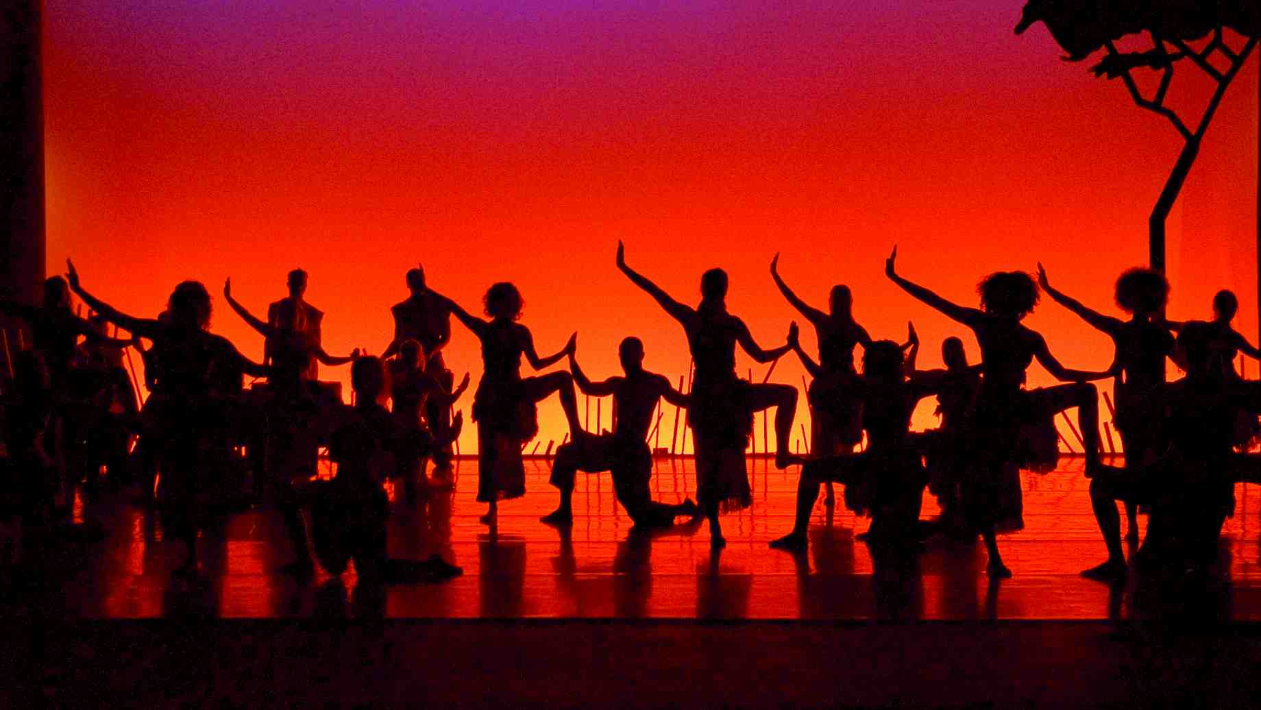
This photo is from a production at the University of Florida, however, the play or performance the picture was taken from is not specified on the website. I thought this was a very interesting use of color. It is very clear that it is meant to imitate a sunset, the colors also make the performers stand out in the environment being represented. I was also drawn in by the colored light coming from behind them.


This image is not an effective use of color, in my opinion. The intensity of the light washes out the actress that is meant to be the focus. The colors on the boat in the background also fail to set a mood, but rather just seem to be used to make it less distracting. It may be an attempt at a dawn or dusk but this is not clear with the red/purple color used.